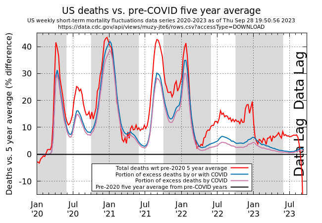
Below is a graph made with the same data shown in an earlier post. This time total deaths and deaths allegedly by or with COVID are compared week by week to the average deaths from before 2020. For 2020 the 5 year average is from the years 2013 to 2017, 2021 is from years 2014-2018 and 2022 is compared with 2015-2019. The data is normalized to the excess deaths so the five year average is by definition always 100% and shown and is thus a flat line in blue.
The grey areas denote the flu season in the northern temperate region.

US Excess Deaths during and after the COVID years
It’s evident we are still suffering from more deaths than history supports.

You must be logged in to leave a reply.